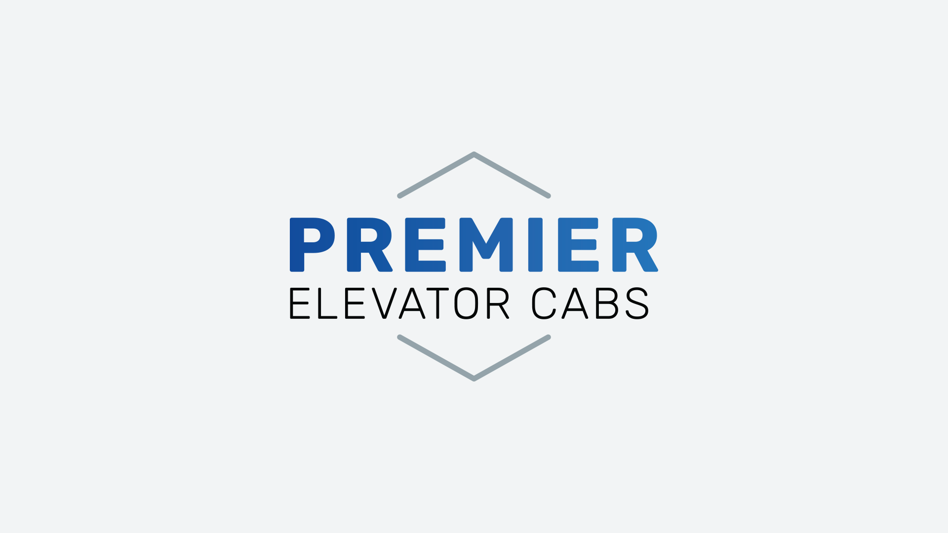
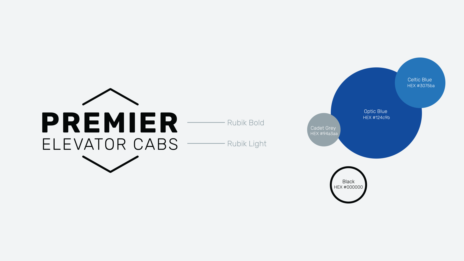
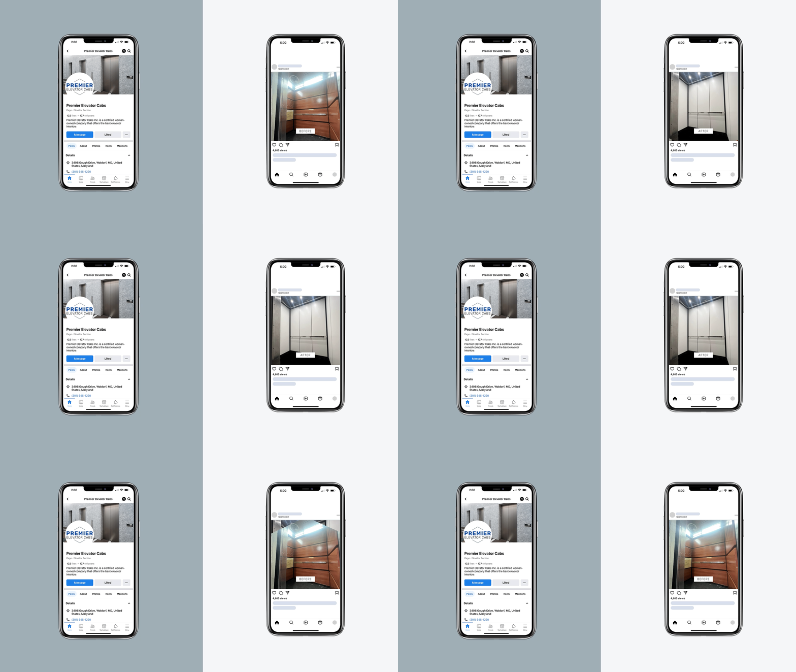
When the ownership of Premier Elevator Cab changed hands, they needed a branding refresh to keep them feeling fresh among their competitors. They excel at transforming old elevator cabs into modern and refined spaces and wanted their logo to better reflect that. We opted for a gradient in their primary logo to give it a bit of razzle-dazzle and a sleek and legible sans serif. "Optic Blue" is a saturated version of their previous company color. We boosted the vibrance to give it the electric charge it needed.
