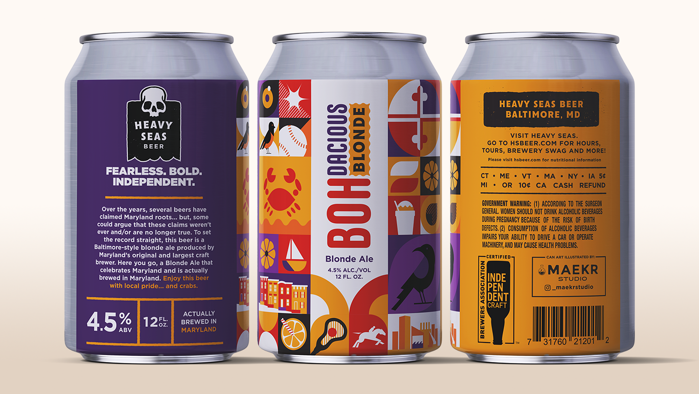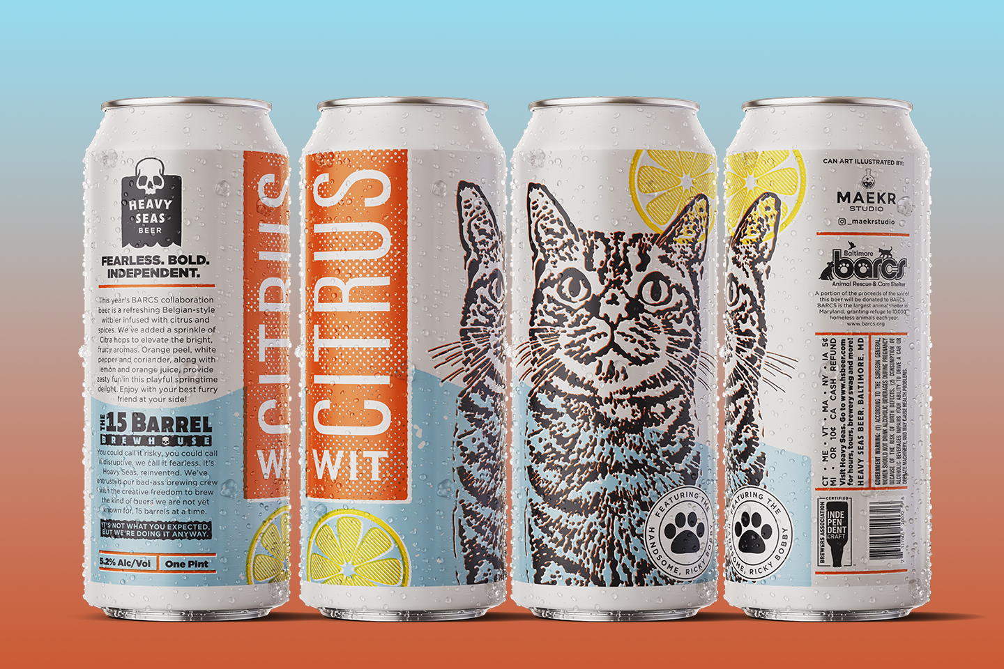
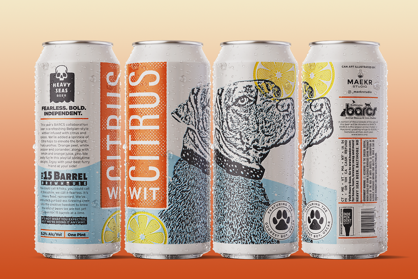
Every year, Heavy Seas and BARCs (an animal rescue organization in Baltimore) collaborate on a limited edition beer where pet owners can enter their animals into a contest for the chance to be featured on the can label. Lately I've been really drawn to print misalignment and thought it could be interesting to replicate it on a label. Overprinting is traditionally known to be an error but when used intentionally, it adds warmth and character. This felt really appropriate in the context of a can being sold to benefit such a wonderful cause, animal rescue and welfare. Given that this is a light citrusy wit beer, I opted for a playful color palette and lots of layered texture. The perfect introduction to summertime. Cheers!
